Hydraulic skidding equipment manufacturer Hydra-Slide Ltd. has unveiled a new brand image and website. The concept was developed in collaboration with Chicago-based branding and design firm, Thrive Creative.
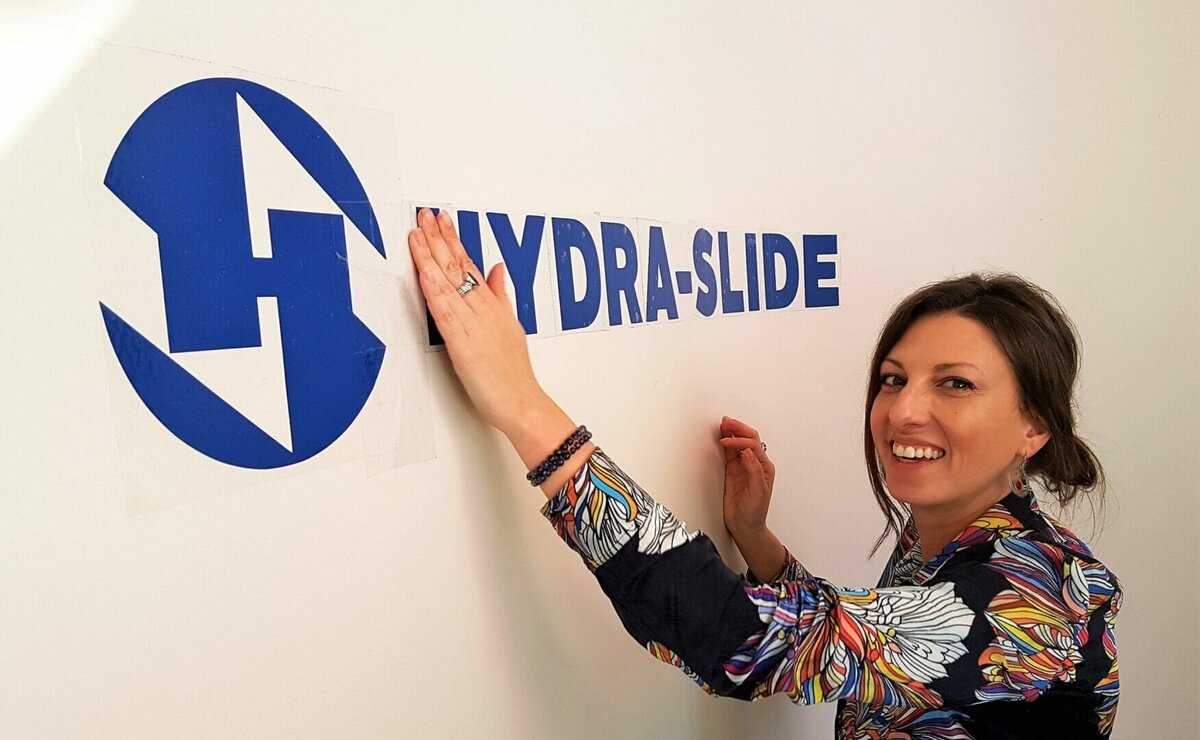
A vibrant new logo represents a fresh and modern reimagining of the company’s founding identity. The logomark itself is composed of elements that reflect Hydra-Slide’s corporate identity and core products in a way that is both striking and instantly recognizable. The bold “H” is a direct signifier of the company name, formed by the activated negative space within the logomark circle.
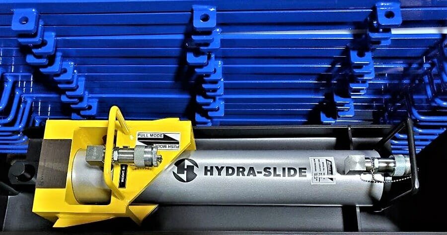
The negative space creates angled “tracks”—a subtle nod to the hydraulic tracks that Hydra-Slide manufactures. The colors are a subdued and sophisticated update of the company’s previous color palette, which was important to preserve. The dark blue and gold maintain the previous palette’s contrast and color signature while introducing additional elements of professionalism and reliability.
Hydra-Slide and Thrive Creative agreed that as technology plays a more comprehensive role throughout the industry, companies on every level are finding it harder to distinguish themselves and be seen by customers. In an increasingly noisy, crowded marketplace, no longer does the handshake simply get (or keep) the business. In order to be seen, trusted, and recommended in the appropriate market, modern companies need a brand that connects with their audience visually, strategically, and emotionally—a brand that reflects not just superior ability, but authenticity.
Two-fold approach
The new website (www.hydra-slide.com) needed to function in two very distinct ways: first, it needed to provide users with a thoughtful, calculated way to experience the new brand and learn about the company’s various products. Second, it needed to guide users through a series of digital interactions designed to bring them to a point where they could quickly and easily contact a member of the team to learn more about a specific product. The manufacturer wanted users to understand Hydra-Slide as a newly reimagined brand, one that’s got its eyes firmly focused on the future, while understanding its history and seeing the true depth and breadth of an innovative product offering.
The backbone of the overall rebrand was Hydra-Slide’s journey, which saw it quickly evolve from a father-daughter team working from home to an internationally recognized company. The cornerstones of the project were not only the logo and website, but also the mission, values, and brand promise.
As Janine Smith, vice president at Hydra-Slide, said: “We used this opportunity to reflect on the reason we exist and what we want to provide to the industries we serve —namely safety, simplicity, and good, practical equipment. We believe one of the main reasons for our success and solid reputation is that we act on the golden rule every day: treat others the way you want to be treated, and that means looking after our customers.”
She added: “We are very proud of the look and feel of our new logo and website. We’re also happy we had the opportunity to reflect on our company’s mission and values. We have built ourselves from the ground up, and from the beginning we’ve always been a values-driven company, but until now we hadn’t taken the time to codify those values. As we grow and add members to our team it is essential that these core values inform our interactions with customers, suppliers, and reps, and that they are infused into all aspects of our operations.”
Picture: rebrand2.jpg
Caption: Janine Smith, vice president at Hydra-Slide, unveils the new logo.
P

